Customize Landing Page
Goals:
- Update the Header
- Update the Hero
- Update the Feature Images
- Update the Testimonials
- Update the Features
- Update the Footer
Landing Page Structure
The landing page is defined at the app/routes/index.tsx route file.
<div className="relative space-y-16 overflow-hidden bg-white text-gray-800 dark:bg-gray-900 dark:text-slate-200">
  <Hero socialProof={data.socialProof} />
  <LogoClouds />
  <FeatureImages />
  <Testimonials items={data.testimonials} socialProof={data.socialProof} />
  <Features />
  <FooterBlock />
</div>
Header
On every marketing/front page, you need to add the app/components/front/Header.tsx component to define your navigation structure.
💿 Open the Header component file and add a new navigation item:
const links: NavbarItemDto[] = [
    { path: "/", title: t("front.navbar.product") },
    { path: "/pricing", title: t("front.navbar.pricing") },
    { path: "/docs", title: "Docs", className: "" },
    { path: "/blog", title: "Blog", className: "hidden xl:block" },
+    {
+      title: "My navbar item",
+      items: [
+        { path: "/my-path-1", title: "Title 1", description: "Description 1" },
+        { path: "/my-path-2", title: "Title 2", description: "Description 2" },
+        { path: "/my-path-3", title: "Title 3", description: "Description 3" },
+      ],
+    },
  ];
This will create a Flyout navbar item:

Hero
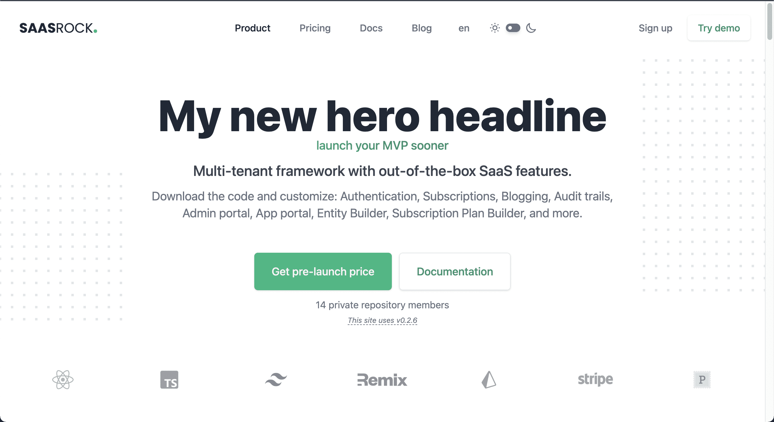
The Hero component uses translations.
💿 Open the public/locales/en/translations.json file, and replace Easily Build Your Own SaaS to My new hero headline (which is the front.hero.headline1 i18n key).
Feature Images
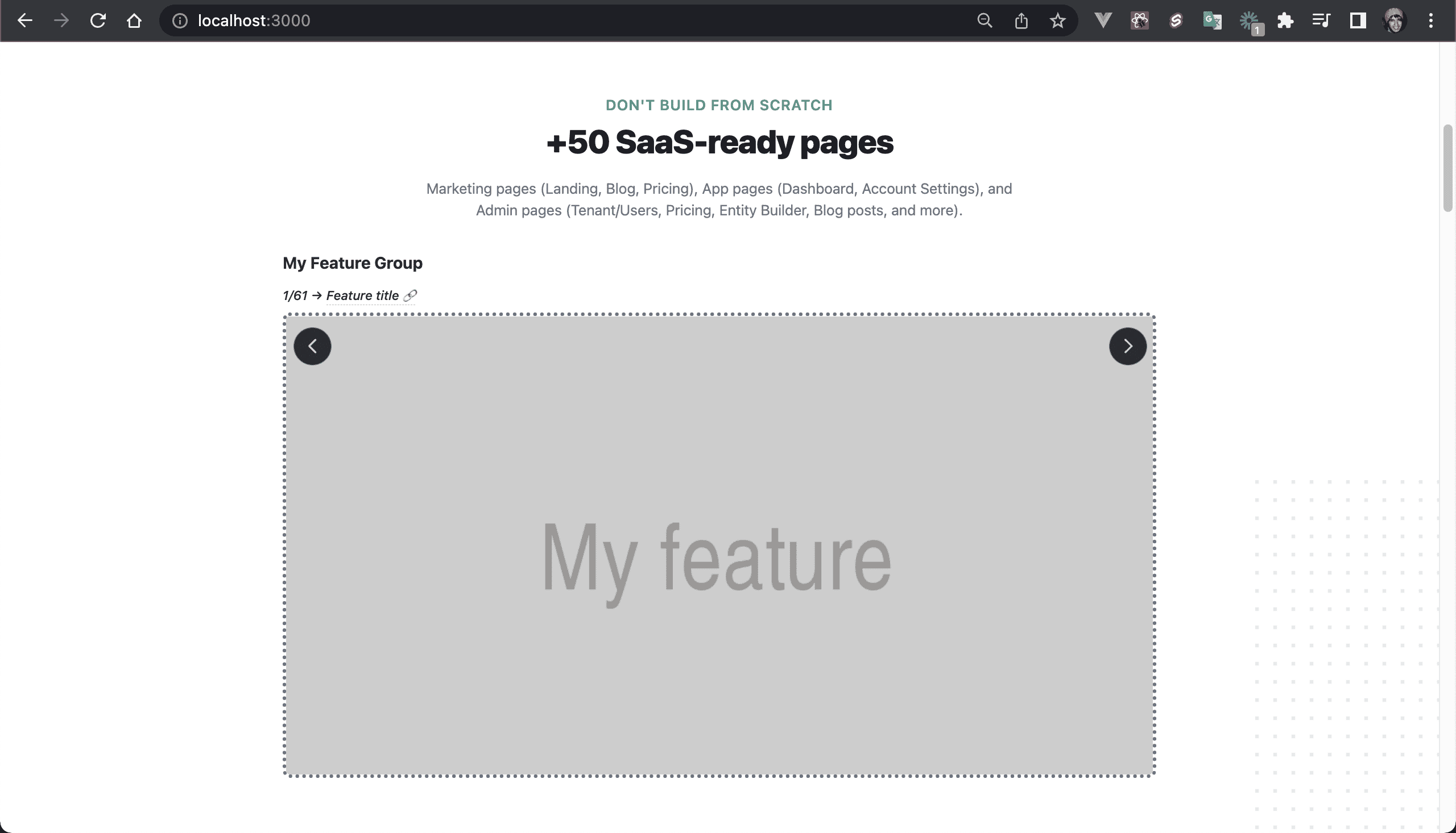
The component FeatureImages lets you showcase your product.
💿 Open the app/components/front/FeatureImages.tsx file and add a new feature:
const featureImages = [
+  {
+    group: "My Feature Group",
+    title: "Feature title",
+    route: "/feature-route",
+    src: "https://via.placeholder.com/1000x500.png?text=My%20feature",
+  },
  ...
Testimonials
There are 2 main objectives with this section:
- Social proof
- Quote current customers
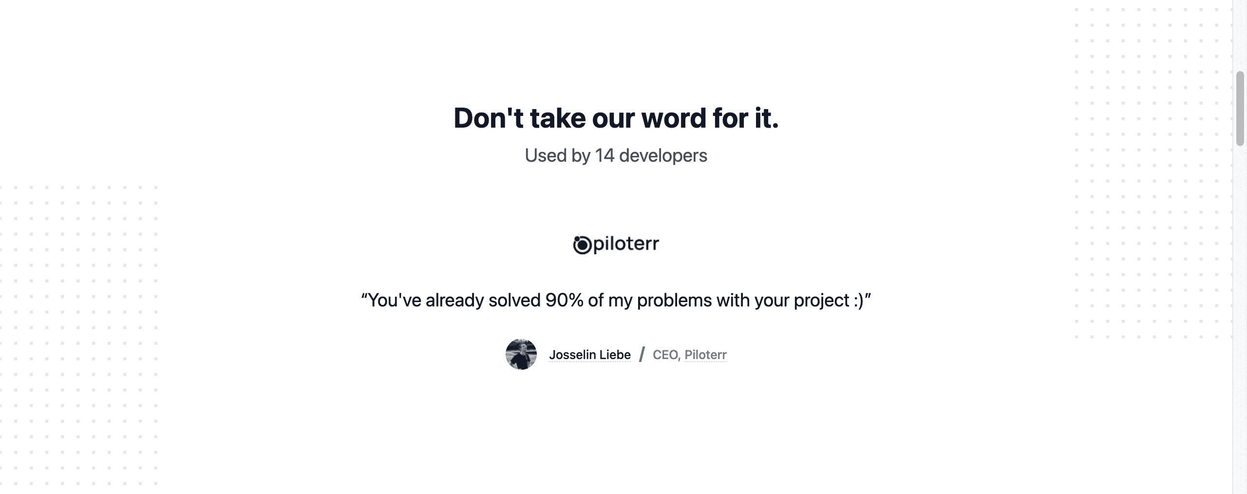
For social proof, I actually use the GitHub API (at the app/utils/integrations/githubService.ts file) to get the current private repository members: used by X developers.
And quotes are hard-coded at the app/utils/services/marketingService.ts file, with the getTestimonials function.
Each testimonial has:
- Company Name, URL, and Logo (light and dark mode)
- Name, Avatar, Role, and their Twitter or personal website.
- The Quote
Features
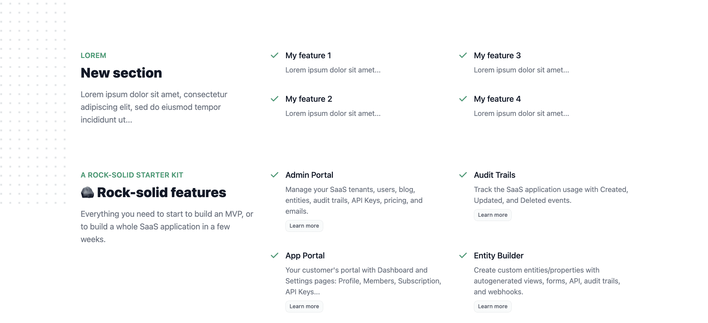
💿 Open the app/components/front/Features.tsx component and add a new section with 4 features.
...
const groups = [
+  {
+    headline: "New section",
+    subheadline: "Lorem",
+    description: "Lorem ipsum dolor sit amet, consectetur adipiscing elit, sed do eiusmod tempor incididunt ut...",
+    items: [
+      {
+        name: "My feature 1",
+        description: "Lorem ipsum dolor sit amet...",
+      },
+      {
+        name: "My feature 2",
+        description: "Lorem ipsum dolor sit amet...",
+      },
+      {
+        name: "My feature 3",
+        description: "Lorem ipsum dolor sit amet...",
+      },
+      {
+        name: "My feature 4",
+        description: "Lorem ipsum dolor sit amet...",
+      },
+    ],
+  },
   ...
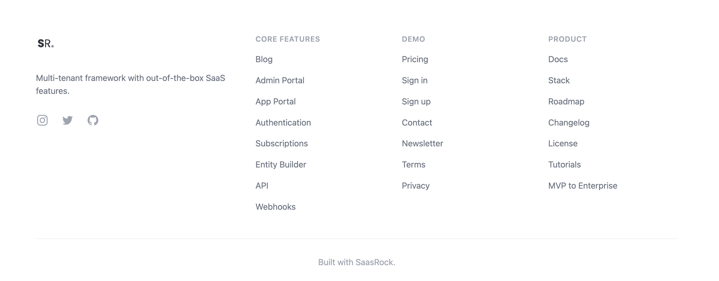
Footer
Finally, we'll add an item to the footer.
💿 Open the app/components/front/Footer.tsx component and add a link to the Blog.
...
const navigation = {
  features1: [
+    { name: "Blog", href: "/blog" },
    ...
I hope this quick guide was useful! Let me know if you have any question.